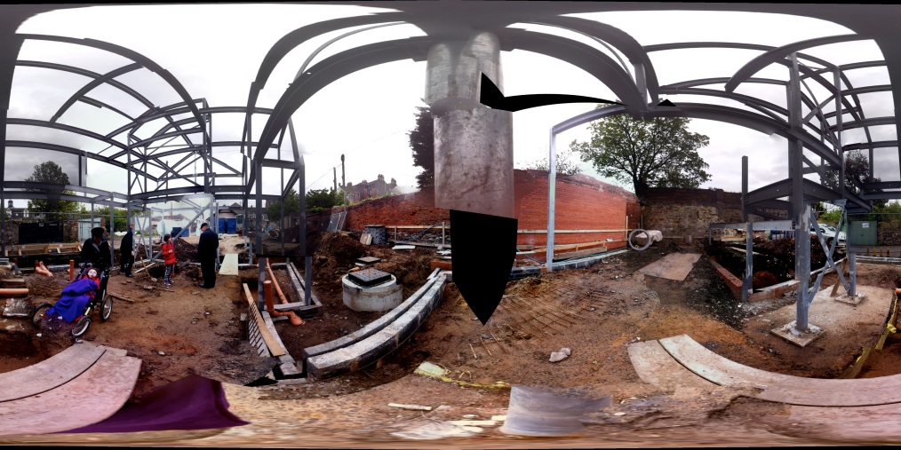
 look at this on an iPhone or iPad through the photosynth app to stand right in the middle of our build
News
 People are often amazed that two architects have managed to design a home together, not to mention including their two children in the design process, but I always tell them, it was easy. And it was easy for one reason: we had such a strong brief with a driving reason to build, that every design decision was a delightful realisation of a place that our daughter would be able to use without having to ask for exceptions to be made. So much of her life is frustrated by obstacles in her way; the main ones are physical, environmental, spatial ones, something which as architects we feel ashamed of, but also empowered to do something about. We are in the exceptional position of understanding through our family’s experience what hinders, and knowing, as designers, how to put that right. So when you turn this to the problem of designing a (barrier free) family home it suddenly becomes an enabling process rather than a problem.
Having to think differently around how we use spaces, and how we move around them starts to produce unusual places. I was already interested in how children move around in, and perceive spaces through my PhD research (link), and had often noticed that children will choose to run up a ramp (then often jumping down the stairs if they are on the other side). For our daughter this movement through spaces is just as important, and the way for her to be able to access this experience is by designing a ramp that she can negotiate in her many wheeled vehicles (link bike, 4 wheeler, wheelchair). But once you calculate the ramp needed to climb from a ground floor to a first, it quickly becomes apparent that the ramp will need to do more than just that. So we have designed a ramp which unwraps to connect to a number of different spaces, each of which can be used along the way.
By designing the house as spaces arranged around a ramp, we have enabled Greta to join us in a full experience of the spaces of our everyday lives. Whilst many public and private spaces still act as a barrier to her full inclusion, this house provides an environment which she and her friends and family can experience, learn from and enjoy together. Designing all the spaces to work as part of the movement along the ramp, with the ramp as central to the spaces, allows the architecture to develop in a rich spatial unfolding, whilst also enabling us all to use the house together.
Involving the children in the design allows them to explore creatively what they need and what they desire. It also means that their occupation of the spaces once built will become another part of this process.
Whilst all the excitement of the steel structure was happening, we were also flat out getting our current house ready to sell. This meant many late nights painting and organising, and then finally last weekend we were ready to let people in.
Sitting, waiting in our very tidy house was a bit like waiting for a party to start, but without the food and drink. We had no idea if anyone would come, and what they would think. Fortunately the house was soon buzzing, and at one point Bee had to take on the role of tour guide for us: her main aim was to show the viewer all the best climbing places in the house. So now a total of fourteen sets of people have viewed the house, and we have had some really lovely comments, now we just have to wait and see.
This house has been a very lucky house for us, and we would not be moving if we didn’t have to. I still remember the first time we came to see it, where everything was painted dark brown and green, the front garden and back lane were just tarmac, and all the doors opened out onto the crowded landing: and Ian and I stood upstairs and discussed whether we could make it work: I’m so glad we took the risk.
I remember coming here with Bee when it was a building site, with our ridiculously ambitious 5 week schedule, and she was most fascinated by the whole in the bathroom floor which looked down into the living room. I also remember sitting on our red velvet sofa in the kitchen with my feet up, knitting, 8 and a half months pregnant with Greta, whilst Ian unpacked every single box we owned, which filled the whole space of the sitting room.
Greta was born in this house, and we were lucky enough to have been able to keep her, and to be able to carry on living here and making more good memories. This is a house that has both wonderful family memories, and also wonderful family rituals of yearly parties, birthdays and anniversary celebrations. We can take those family rituals with us to our next home, and we hope to be able to hand the house on to somebody who will cherish it and enjoy it just as much.
Cottage Pie
Guest Blogger Ian McMillan writes: Working on projects where the Net/ Gross efficiency of the floorplates and the extent of circulation versus usable space is paramount, And having a ramp through the house, I was somewhat reluctant to crunch out the figures. Our current house is very tight with space, but we’ve optimised it to 50% living accommodation, smaller bedrooms and a quirky ‘open plan’ bathroom – and all in 72m2, which is below the 78m2 standard UK house size for a 3 bed house. The new proposal, although 140m2, sounds absurdly huge but it’s just the size of a standard Danish family house. Which is still well below the States and Australia. So where is all this extra 62m2?
The figures below show that we’ve still kept the bedrooms at a standard size (but have carved the space away above them and introduced rooflights to make them feel brighter and more spacious), and like our current house we’ve tried to optimise the space for the living accommodation. But rather than one single space, it’s fragmented into different levels which come off the various levels of the ramp.
Squirrel Cottage Areas m2 UK Cottage Areas m2
| Sleeping (x3) | 33.5 | Sleeping (x3) | 31.0 | |
| Living Space | 21.4 | Living Space | 14.0 | |
| Kitchen/ Eating | 22 | Kitchen/ Eating | 12.5 | |
| Circulation | 41.3 | Circulation | 8 | |
| Therapy | 7 | Therapy | 0 | |
| Ancillary | 4 | Ancillary | 1.2 | |
| Wetroom | 5 | Wetroom | 4 | |
The ramp itself is the biggest space user being 41.3m3 and accounting for 31% of the building, as opposed to the typical house where the stair and any corridors would account for 11%. This is a big spatial investment, however as the ramp is integrated into the house (as opposed to being a ‘bolt on’), it will spatially become part of the living accommodation. Saying that, It will be interesting to see how we physically use this sloped surface aside from its primary purpose of circulation!


